Showing posts with label Photoshop. Show all posts

February 15, 2019

Collage: Dialogue

digital collage by Susanna King
I've been in an artistic slump for a while now. For a long time, I didn't feel like creating anything. More recently, I've been inspired to create but felt awkward and out of practice. I wasn't sure how to start again.

These digital collages inspired by a single word have been my go-to creative exercise for years. Even though I couldn't think of a good word myself, I remembered that an email newsletter I get from the Society of St. John the Evangelist includes a daily word for meditation.

Art is a form of meditation for me, so today I meditated on the word "Dialogue." I used my tried and true formula: searching for Creative Commons-licensed images on Flickr using this word, and selecting the ones that spoke to me. The photos included in this collage were taken by Katie Taylor, Olga, and Scott Schiller.

September 30, 2016

Collage: September Diptych

It's been a while, but I finally made some new desktop picture collages. This month, I was not very creative and just searched Flickr with the word "September".

Because I have two monitors, I created two complimentary collages, like I did with my fog diptych.

September 1 by S. King

September 2 by S. King

The first image is on my main monitor and the second is to my right. I like how looking from left to right is like looking from the beginning to the end of September, from the last days of summer to the start of October and Halloween season.

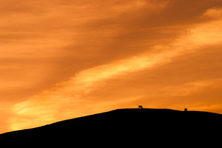
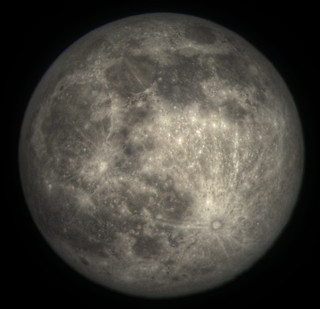
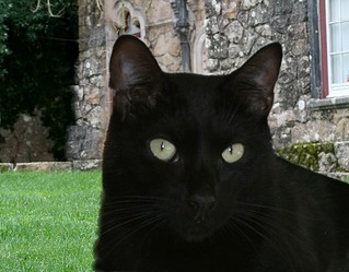
Here are the 4 images I used as my sources:

Crop Rotation (Sunset & Cows), Dorset
harvest moon september 22nd 2010
Fonti del Clitunno  [Explored]
Hello Flick Family. Read My Story. Know My Name :))

I used the Pixellate > Pointillize filter a lot in both collages. For the second, I also used the halftone filter. One of the pointillized layers from the boat image is in the moon picture, to add more texture and color. I used the threshold filter on a cut-out of the cat to make the shape stand out and look more like a shadow.

November 26, 2014

Collage: Fog Diptych

Recipe for my monthly desktop picture collage:
- choose a word or phrase
- search on that word in Flickr
- select a few of the resulting images
- mix & mash in Photoshop

This month's word is "fog."

While working on the first collage, I had an idea for a variation on it and decided to make this a diptych, or set of two images. Since I use two monitors both at home and at work, now I have a separate background image for each screen.


The photos I used for these collages were taken by Patrick Strandberg, Ingrid Taylar, and Phil McIver.

What really excites me about these pieces is that I was able to use a databending technique that I've never managed to get to work before. I saved one photo in RAW format, opened it in Audacity, ran an echo filter over the middle of the image data, then exported the file back out. Here's the result:


I love the shapes that resulted, the circles and crossed diagonal lines. You can clearly see where I used this image in both collages.

One odd thing about this month's theme: As I worked with the picture of fog that had been glitched in audio software, a phrase kept popping into my head, "the noise of the fog." Those words carried a sense of apprehension, and I wondered why. Then I remembered that I once wrote something with that title. I think it's probably a poem. I vaguely remember seeing the title on my computer and having the sense that it was a Pandora's Box of sorts and I shouldn't leave it sitting around for anyone to open.

After I remembered all this, I looked for the file. I haven't found it yet, which means it's in some really old archives, if it hasn't been deleted. If I find it, I will post about it, with the caveat that my life isn't that interesting, so the mystery probably isn't going to live up to the hype.

October 31, 2014

Annual Scary Collage: Paranoia

I couldn't think of one individual person right now who's notably scary. Instead, it's the pervasive atmosphere of paranoia right now - in large part thanks to the media, both social and mainstream - that's scaring me. This paranoia creeps into the minds of otherwise normal people, turning them  irrational, unpredictable, and sometimes dangerous.


As always, I did an advanced search on Flickr for Creative Commons-licensed photos using the word "paranoia." I got a lot of great results, but ended up using only three.

This photo of a (Swedish?) report from Anders Samberg:

Paranoia

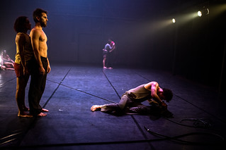
This photo from a dance called "Paranoia" from Vivadança Festival Internacional:

Paranóia

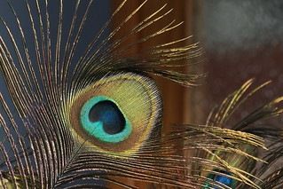
And this photo of a peacock feather from Jordi Cucurull:

Paranoia

I tried to make the peacock feather into a set of creepy, inhuman eyes. I used the Sketch: Graphic Pen filter to make them look like they're on a screen or in a hologram. I used the wave filter on different parts of the image and layered them with layer masks of varying sizes to make it look like the electronic interference is spilling out of the "eyes" onto the people.

I had a lot of fun working with the text. I used the Distort: Spherize filter on one layer of text, then made another layer with larger text flipped around backwards to make the letters less recognizable.

At one point while working with this collage, I had to completely stop and start over. That's always a hard thing to do with any piece of art. If your original vision isn't working out, do you keep pushing or abandon it? I ended up backtracking almost to the beginning and heading in a completely different direction, letting the medium guide my vision instead of trying to forcibly create the image I had in my head. I'm glad I was willing to trash hours of work and start over. I think the resulting collage is exactly the sort of creepy, dystopian image I had in mind.

October 18, 2014

Digital Collage: I Dream of Texas

I thought it might be illuminating to describe how I put together the photo illustration I created to go with my previous post.

I started with an idea based on an image of the dream itself: Mary standing behind her grandfather, who was dressed in a suit and laid out on a steel table, with a map of Texas behind them. I thought that might be a little too macabre, not to mention too time-consuming, so instead I skimmed through Morguefile for pictures of women who looked vaguely like Mary as she appeared in my dream.

This is the image I started with:

I chose this picture because the girl looks very neutral: blank wall, neutral expression.
I'll be able to alter her appearance however I need to.

In my dream, Mary was sickly-looking and had bad acne. So instead of using Photoshop to make someone look better, in this case, I was trying to make her look worse. I did that by
  • Scaling the photo horizontally, then using the Liquify filter on her face to make her thinner.
  • Using the techniques described in this photo retouching tutorial to add shadows on her cheeks and under her eyes.
  • Using the stamp tool to take acne from another photo and add it to her face. I set the acne layer to overlay so it blended naturally.
  • Changed her hair from red to blonde using Image > Replace Color.
And here's how she looked after that:

Mary's had a rough few months.

Then I used the patch tool, stamp, burn tool, and brush to remove the glare on her glasses. After a little more Liquifying to shorten her chin and enlarge her eyes, I saved the picture as a flat PSD file.

I found a great old map of Texas on Wikimedia Commons that I wanted to use as the background. This tutorial on selecting hair was exactly what I needed to create the composite. 

If you look carefully, you can see I didn't do a perfect job selecting her hair,
but I figured it was close enough for my purposes.
Now the really fun part: changing all the colors to make it look crazy and dreamlike! I used the layer effects palette to add a gradient fill over Texas. Then I created a layer above but below the photo, filled it with green, loaded the photo's layer mask as a selection,  and expanded and feathered it the selection to make a shadow mask. This helped the photo stand out from the background better.

The green shadow layer is set to Multiply.
Mary's face still didn't look nearly as red as it did in my dream, so I again loaded the layer mask as a selection, created a new layer above the photo, and filled the selection with hot pink. I tried several different blending modes for the layer, and liked the way Hard Mix looked (Vivid Light and Color Burn are two other modes I tend to favor).


Girl, that color really brings out the texture in your zits!
The color looked great, but there wasn't enough detail, so I copied the original photo and put it on top with the blending mode set to Screen to capture the higlights.

Almost there...

Then, just one more layer to add the shadows and some of the natural color back in: another copy of the photo set to Multiply. Voila!


Here are the layers palettes from the two files I created.


October 30, 2013

Annual Scary Person Collage: Michael Needham

Every October I make a photo collage based on a scary person. (See previous efforts here and here.) This year, I chose for my subject Michael Needham, the CEO of Heritage Action of America.


For me, the best part of this picture is how I took an ordinary close-up promo picture and uglified it, using photo retouching techniques in reverse. I enlarged the bags and circles under his eyes, enlarged his nose, darkened the lines on his face and his stubble, made his ear misshapen and his eyebrows bigger and messier. I also used the liquify tool to turn his smile into a sneer.

Now he looks like a zombie, with the sinister Gentlemen of Heritage elongated and lurking in the background.

November 15, 2012

Digital collage: Terry Krishna Become Destroyer of Compassion

A few days after I lamented that I couldn't find a scary person for my October photo collage, I found one on the editorial page of The State. The letter was a response to this piece by Leonard Pitts. The woman who wrote it showed a shocking lack of compassion for the abused woman in Pitts' column, saying that, regardless of the circumstances, anyone who broke the law for any reason ought to be treated as a criminal, pure and simple. No mitigating circumstances, like coercion or fear for one's life, ought to be considered. The letter writer's name was Terry N., and apparently I didn't save a link to her letter. I can't find it in The State's archives, either. This is all to the good, I think, as I'm not trying to vilify this particular person, but rather use her as an example of an attitude endemic in America today.

Upon deciding that she would be the subject for my October collage, I went online and searched for her on Facebook. Her last name is fairly unique and I immediately found her page. (Ironically, one of the causes she listed was anti-bullying because her daughter had been bullied in school.) Lots of pictures of her family and friends, but there was only one picture of her: a small, black-and-white photo of her face. A Google search turned up the same photo in a profile on another site.

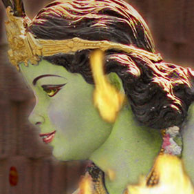
Without much to go on, I decided I needed to add to the theme of the photo. Along the same lines as Jack Valenti-Cthulhu, Karl Rove-Puppetmaster, I decided to do Terry N.-Destroyer of Compassion. I was inspired by the quote from the Baghavad Gita, made famous by J. Robert Oppenheimer, "I am become death, destroyer of worlds." In the Baghavad Gita, this phrase is spoken by Krishna. So I went to Flickr and did a search for Creative Commons-licensed photos using the word "Krishna."

Unfortunately for my purposes, most of the pictures showed Happy Nice Krishna surrounded by his happy, celebrating followers. I had to dig a bit to find anything that looked even remotely threatening or scary (I suppose if you have terrible allergies piles of flowers might be scary). I ended up using a photo of a statue of Krishna fighting snakes taken by abrinksy, a photo of a tapestry by dabera, a picture of a Hare Krishna praying and another picture of one of their festivals by Klaveius. To these, I worked in tiny bits and pieces of Terry N.'s profile photo.

So I created a sort of anti-Krishna not defeating the snake Kaliya, but joining forces with him. I personally think the scariest part of this picture is the cobra with the red human eye.

Click to see large version

Here's a side-by-side comparison of original Nice Krishna and Photoshopped Mean Krishna:


September 1, 2012

Digital collage: Weather

Recipe for my found image collages:
  1. search for Creative Commons-licensed images in Flickr using the word or phrase of the month
  2. fave and download the ones that strike my fancy
  3. put them all together in Photoshop
  4. share the result with the world
This month's word is "Weather." Since hurricane season begins in earnest in August, I find myself checking the weather a lot more often this time of year. The weather also tends to be the focus of the news when storms begin to affect the southeastern U.S.


Credits: The map photo inside the sphere is from NASA Goddard Space Flight Center, the sphere itself is from Donald Macleod, the sky in the background is from Kent Wien, the pixelated text in the front is from a photo of a digital display by Rod Begbie, the barometer is from Jennifer Woodard Maderazo, and the texture over the top of everything is from Darren Hester.

After last month's mistake, I was very careful not to delete anything. All the layers - copies, experiments, whatever - are still in the file. So now I can show you my first stab at the collage.


I liked it, but thought it needed something more, so I added the barometer and the texture. I used Image > Adjustments > Posterize filter to simplify the barometer photo, then Threshold to make it black and white. I did two different versions of the barometer with Threshold, then set one image above the other at 50% opacity and merged the two. I think the result looks like something from the old early-90's Mac games.


So that's my August collage. And now that month is over, and it's time for me to find a word to illustrate for September!

August 6, 2012

Photo collage: "Becalmed"

It's already August, but I've been looking at my July photo collage for a couple of weeks, even though I haven't written about it yet. It's set as the desktop background on my extra monitor. I found having the picture next to me all day, within my line of sight, helped get me over creative roadblocks I had during its construction.

This post was supposed to be about each of those roadblocks and what I did to take the collage ever closer to the finished piece at each stage. I was going to show what the picture looked like at each of those stages.

Alas, at some point I saved the newer version of the file (July2012_Becalmed_simplified.psd) over the top of the original file (July2012_Becalmed.psd). Now all I have is the minified photoshop file without all the messy unused layers that show how I built all the pieces. I feel like all my effort has been lost somehow, even though I have a final image that I'm quite happy with.

I did manage to salvage one older iteration of the collage, without the wavy lines. But the older versions, with the single-color "jellyfish" and the wider stripes, are lost. Maybe I need to start using Subversion for my photo collages.

So here it is, "Becalmed," built from a picture of Harper's Ferry, WV by Eoghann Irving, a photo of some luminescent jellyfish at the New England Aquarium by Seth Pipkin, and a picture of the sea off the south coast of England by Richard Leeming.

The final version of the collage.
Second-to-last iteration: I decided it needed more movement and waviness.

July 18, 2012

Making an Abstract SC Poster

I recently saw this picture of Mickey Mouse on Pinterest:


Looking closely at it, I realized it was made with Photoshop brushes. Simple, but effective. I decided to see what I could create with my new Ps Defaults watercolor brushes.


I used both the watercolor and the dust particle brushes to create this abstract picture of South Carolina. I especially like the way the background turned out. I made the image big enough that it can be printed as a 16"x20" poster.

If you like this design but want to see it in different colors (garnet and black, for example), just let me know and I'll be happy to customize it for you.

June 26, 2012

Photo collage: "Reckoning"


For June's collage, I searched Flickr's CC-licensed photos using the word "reckoning." I ended up using four photos from the results: the singer is from rjforster (the band's name is Threshold and they're pretty good if you like metal), the receipt is from Micheal Foley, the stripes come from a Second Life screenshot by TORLEY and the speckled pattern was generated from TORLEY's drawing of a door.

click image to see full size

This is one of those rare images where I had a design in mind from the beginning and attempted to execute it. I wanted to have a wavy, bright blue image of the singer superimposed over the original photo, like an old TV with bad reception.

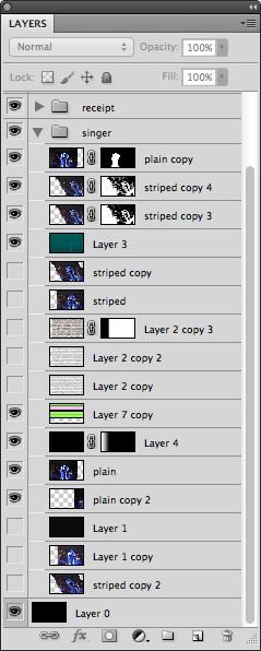
You can see the trial and error process
in my Photoshop layers.
I went through several steps to create each component: the receipt, the stripes, the wavy image, and the grainy photo in the background. Each involved a lot of trial and error and experimentation, so I'm not going to describe the details of how I made the whole thing because, frankly, I don't know if I can even remember everything. Instead, I will just describe the successful steps that eventually led to the creation of the wavy blue picture of the singer.

First, I copied the singer photo layer and used the Artistic > Cutout filter to reduce the detail. Image > Adjustments > Posterize will do this, too, but the Cutout filter also simplifies the edges of shapes.

To create the irregular stripes, I filled a layer with a plain horizontal striped pattern, then used the technique described in my distressed type tutorial. I merged the jagged stripes with a copy of the singer's photo and used the Distort > Wave filter to make it wavy (I put the horizontal setting at 1% to get waves that only went up and down). Edit > Skew let me adjust the angle of the image. I then selected all the black areas with the Magic Wand and made a layer mask from the selection.

That gave me the basics of what I was looking for, but it didn't interact with the background photo the way I wanted it to. So I loaded the layer mask as a selection, then expanded and feathered it (actually, I think I had to use Select > Contract to get the selection I wanted even though that doesn't make any sense). I then copied the wavy blue layer and used my modified selection as a new layer mask. This created stripes with more space between them.

With the original wavy image layer on top of the one with the modified selection, I gave the top wavy image a blend mode of Multiply and the bottom one a blend mode of Hard Mix.

If you're curious about any of the other components of the picture, just ask and I'll do my best to answer.

June 6, 2012

Photo Collage: "Disjointed"

If you look deep into the depths of my web site's archive, you will see a section titled Desktop Pictures. I began creating these collages in Photoshop back in 2002, though it wasn't until January of 2003 that I began to use the single word or phrase searches that I've stuck with since. You can see more recent creations in my DeviantART gallery.

I used to use Google Images, but now I'm trying to be a good netizen by only searching Creative Commons-licensed images on Flickr. Unfortunately, this cuts down on the number of serendipitous screenshots and gif diagrams I get, but the photo resolution is better, which has become important as screen sizes have increased and I've made my collages bigger.

So, here's my formula:
  1. Pick a word or phrase. For May 2012, I chose "disjointed."
  2. Search for CC-licensed images on Flickr using that word.
  3. Select the most interesting results and download.
  4. Use the downloaded images (or a subset) to create a collage in Photoshop.

"Disjointed," May 2012

click to see full size image
I had some great photos for this collage, but I was having trouble putting them together. Then, I read the article Breaking Bits in Pretty Ways on BoingBoing and got inspired.

The background is a photo of some shopfronts by Nick Findley. I used the Cutout filter with the edge simplicity up pretty high to make it flat and angular. Then I adjusted the colors until the green gate stood out.

The letter Y was photographed by Monceau. I masked out the background and used Add Noise with a fairly high number. Then, I made a copy of the Y cut out, used Mosaic with a cell size of 4 to make it look pixellated, and adjusted the color so it matched the door. I set the layer blend to Color Dodge and gave the Y below it an opacity of 33% so the background showed through.

The wing was probably the toughest part. I cut it out of a photo by Travis S of a girl on a beach holding a dead bird's wing. After removing the background and the girl's hand, I upped the contrast and took it from color to black and white. Using black and white as my colors, I applied the Graphic Pen filter. Finally, I set the blend mode to Screen so only the white showed up, and added a layer filled with one of the grays from the background at 27% to keep the wing from being pure white.

I think there are many ways to interpret this: "Wingy," "Birdy," "Fly why?" I haven't decided myself. But I'm really happy with how the final image came out, and I think it definitely looks appropriately disjointed.

May 12, 2012

Distressed and Textured Type Tutorial

If you look at my Deviant Art gallery, you'll see that I enjoy experimenting with Photoshop collages. Recently, I discovered Scottish collage artist Astrid Maclean, whose creations I can only aspire to imitate.

A collage I made in Photoshop. Note the text in the background.

While trying to make something in Astrid's style, I discovered a nifty technique for distressing type. Here are examples using both script and serif fonts. In my example, I'm keeping the text in black and white because step 6 doesn't work well with colors. You can always color the text after you're done messing with it. On the other hand, if you want to stop at step 4, use any color you like.
  1. Type your text.
  2. Copy text layer to create a new layer.
  3. Create a white background layer and merge it with the copied text layer. Note: this will rasterize the text and make it non-editable! 
  4. Select Filter > Ocean Ripple. Set both Ripple Size and Ripple Magnitude to 1.

    You can stop here, or continue:
  5. Filter > Gaussian Blur. I used 1.8 for the top text, 2.2 for the bottom. In general, the thinner the ligatures, the less blur you want.
  6. Image > Adjustments > Levels. Drag the white slider and the black slider both closer to the middle. Adjust the sliders until you're satisfied with the way it looks. You can also use Filter > Sharpen > Smart Sharpen to do this.
If you make something using this tutorial, please post a link in the comments. I'd love to see your creations!